The head banner will be simple, showing the course title and detail. A wire frame graphic will sit behind this. Banners and icons will share a similar style, bold and easy to recognise, these will be colour coded and fit well with the design of the rest of the website.
Monday 11 February 2013
Style and Design Ideas
I would like to introduce a very acoustic and natural style to the blog, simple but still interesting. This style derives from prints and hand made wood carvings. Staying away from sci-fi or CG aesthetics which are too often used for such websites. Below are a couple of design sheets exploring this print style.
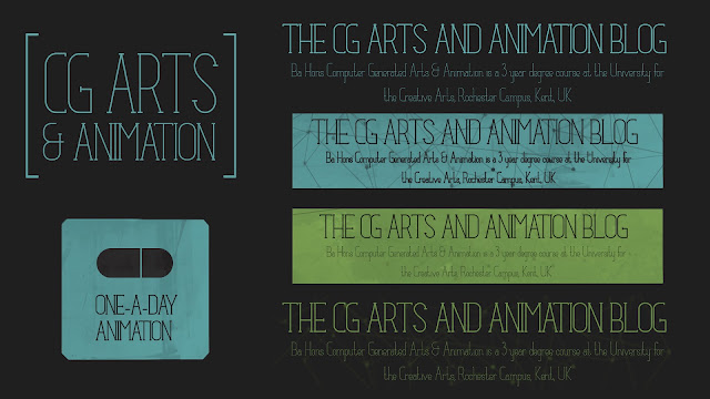
 The font is a free font available for all purposes, it hopefully conveys a lively and exciting message similar to the magic of animation. The colour used will be muted in tone and textured with a realistic print effect to give the appearance of screen printing or wood block printing.
The head banner will be simple, showing the course title and detail. A wire frame graphic will sit behind this. Banners and icons will share a similar style, bold and easy to recognise, these will be colour coded and fit well with the design of the rest of the website.
The head banner will be simple, showing the course title and detail. A wire frame graphic will sit behind this. Banners and icons will share a similar style, bold and easy to recognise, these will be colour coded and fit well with the design of the rest of the website.
Monday 4 February 2013
Blog Updates
So, the basic framework for the blog is starting to come together. It's simple, easy to read / view and large enough to post video and images at a good size. The next task will be to start producing graphical elements, this means a main banner, logos, sub banners etc. This will be where the blog really starts to move forward and take on an identity.
Extra Features:
In terms of features, there are a few blogger ideas which may help the community thrive. Firstly, the poll system on the right hand bar can be used to ask questions and vote for topics. These simple ideas may be a great way of making students interact with the blog.
The bottom of the page will include posts for useful resources, archives, followers etc. In short, the top of the page will be as simple as possible, showing information that the reader will want to interact with first.
Colour / Design:
I personally prefer the blog to look dark but not completely black, this helps link colours and creates something a little warmer. It would make sense for titles / headers etc to be a muted green, this not only fits with the UCA colours but also suits the tone of the blog. Each banner / topic with a logo design will use different colours but follow this muted style.
Test Post #01
With this extended blog format videos and image editorial can be shown on a grand scale. This is especially important for a course focused on the visual arts. The first example, shown using embedded youtube content, demonstrates how video can be watched easily within the main body of the blog.
This content is embedded using 900 x 506 dimensions. Fitting the main body perfectly. Vimeo content equally works great on such a large format.
The Third & The Seventh from Alex Roman on Vimeo.
Allowing such space for the content really means that the content itself runs the blog and the visual design of the site itself can be rather more subtle and simple. Still images will also be able to be shown to full effect. This is especially important for posts which have little text.

This works especially well for concept art images, the one pictured above is set at defual "X-Large" embed options, but images can be tweaked to fit the frame, as shown below. This tweaking can be done very quickly and easily using the HTML editor.

Subscribe to:
Posts (Atom)